
The Met: Museum Website Redesign
The Met website redesign focuses on reducing visual clutter, simplifying navigation, and improving the ticket purchasing and events browsing experience. The original site presented dense navigation and competing content sections that created cognitive overload for users.
This redesign prioritizes clarity, accessibility, and ease of use while preserving The Met’s established visual identity and brand presence.
Year
2025
Role
UX Designer, UX Researcher, Content Strategist
Tools
Figma, Wireframing, High-Fidelity Prototyping, Usability Testing, Interaction Design, Visual Hierarchy Design
*Completed collaboratively as part of a team-based academic design project.
The Problem
The original Met website overwhelmed users with dense navigation, competing content sections, and inconsistent visual hierarchy. Critical tasks such as purchasing tickets, exploring exhibitions, and planning visits required excessive effort and created confusion.
Key usability issues included:
Overcrowded navigation with too many competing menu items
A confusing, pop-up–heavy ticket purchasing flow
Poor distinction between admission types and museum locations
Visual clutter across key pages (Home, Ticketing, Events)
Inconsistent spacing and alignment that disrupted usability
As a result, users struggled to complete core tasks quickly and confidently.
The Solution
The redesigned Met website simplifies navigation, reduces visual clutter, and guides users through key tasks with clarity and confidence.
The experience was restructured around core user needs, visit planning, exhibition discovery, and ticket purchasing, through improved navigation, clearer hierarchy, and streamlined flows.
Key improvements include:
Simplified global navigation
Clear, step-by-step ticket purchasing flow
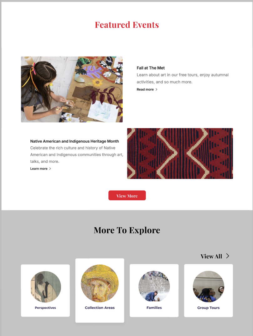
More scannable exhibition and event layouts
Stronger visual hierarchy
Improved confirmation experience
The redesign focuses on removing friction, helping users move from exploration to action efficiently while preserving The Met’s visual identity.
The User & Context
Primary Users
Museum visitors planning trips online, including tourists, families, students, and members.
User Needs
Quickly understand ticket options and pricing
Easily explore exhibitions and events
Plan visits with confidence
Access essential information without feeling overwhelmed
Core User Goal
“I want to quickly understand what’s on view, how much it costs, and how to plan my visit without feeling overwhelmed.”
Design Process
We followed a user-centered, iterative design process focused on simplifying complexity while maintaining The Met’s visual identity.
Process Steps
Evaluated the existing website for usability issues
Identified pain points across navigation, ticketing, and event discovery
Sketched early layout ideas and page structures
Built low-fidelity wireframes to map user flows
Designed and tested a high-fidelity prototype in Figma
Each step prioritized reducing cognitive load, improving clarity, and guiding users through key tasks more intuitively.
Early Layout Exploration
Before moving into wireframes, we explored layout structure, navigation hierarchy, and key user flows through quick sketches.This phase focused on simplifying dense navigation, breaking content into scannable sections, and improving wayfinding before committing to structured layouts.
Home Page Layout Sketch
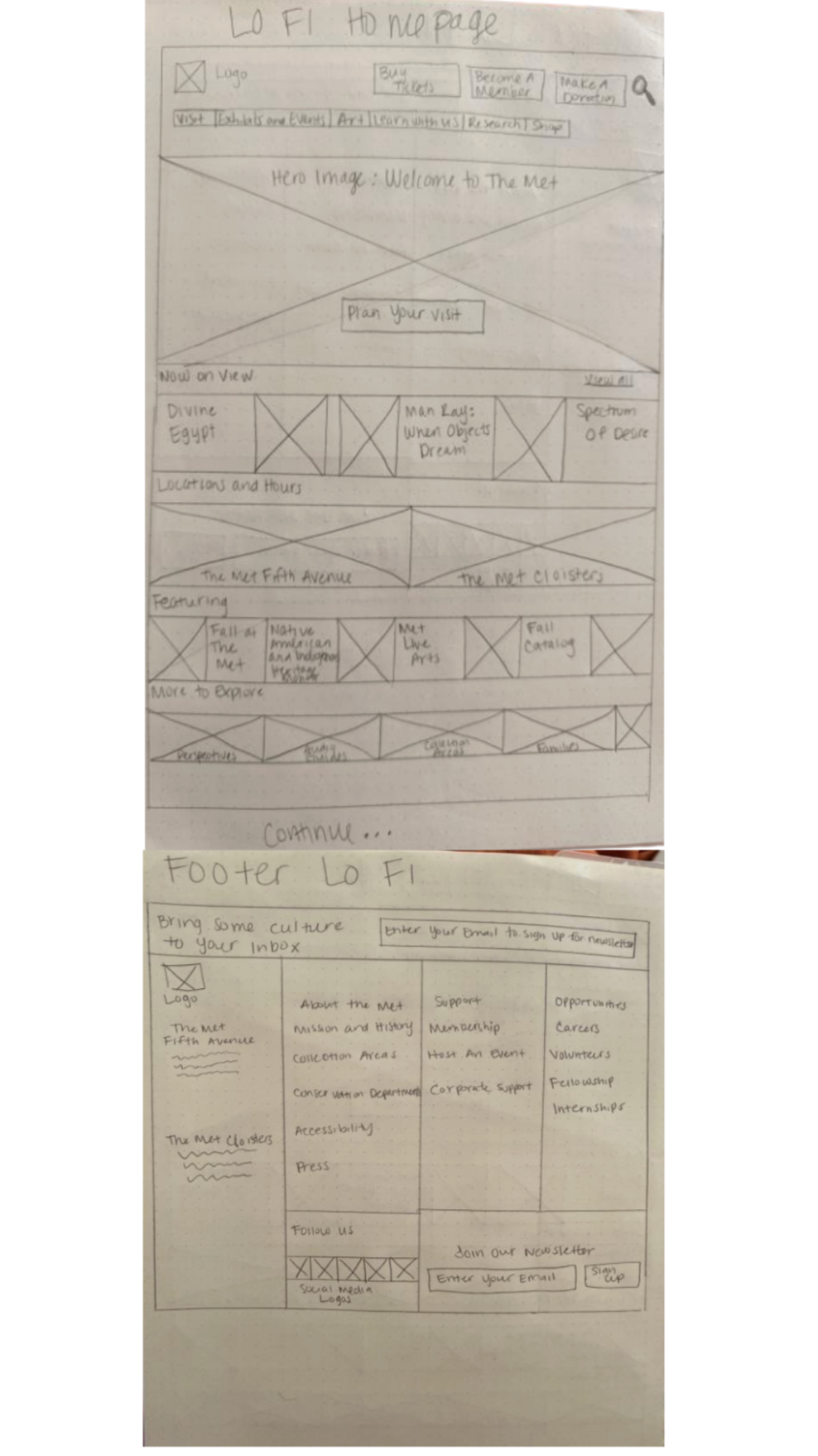
Focused on reducing visual clutter, prioritizing “Now On View,” and surfacing key actions like ticketing earlier in the experience.
Ticket Purchasing Flow Sketch
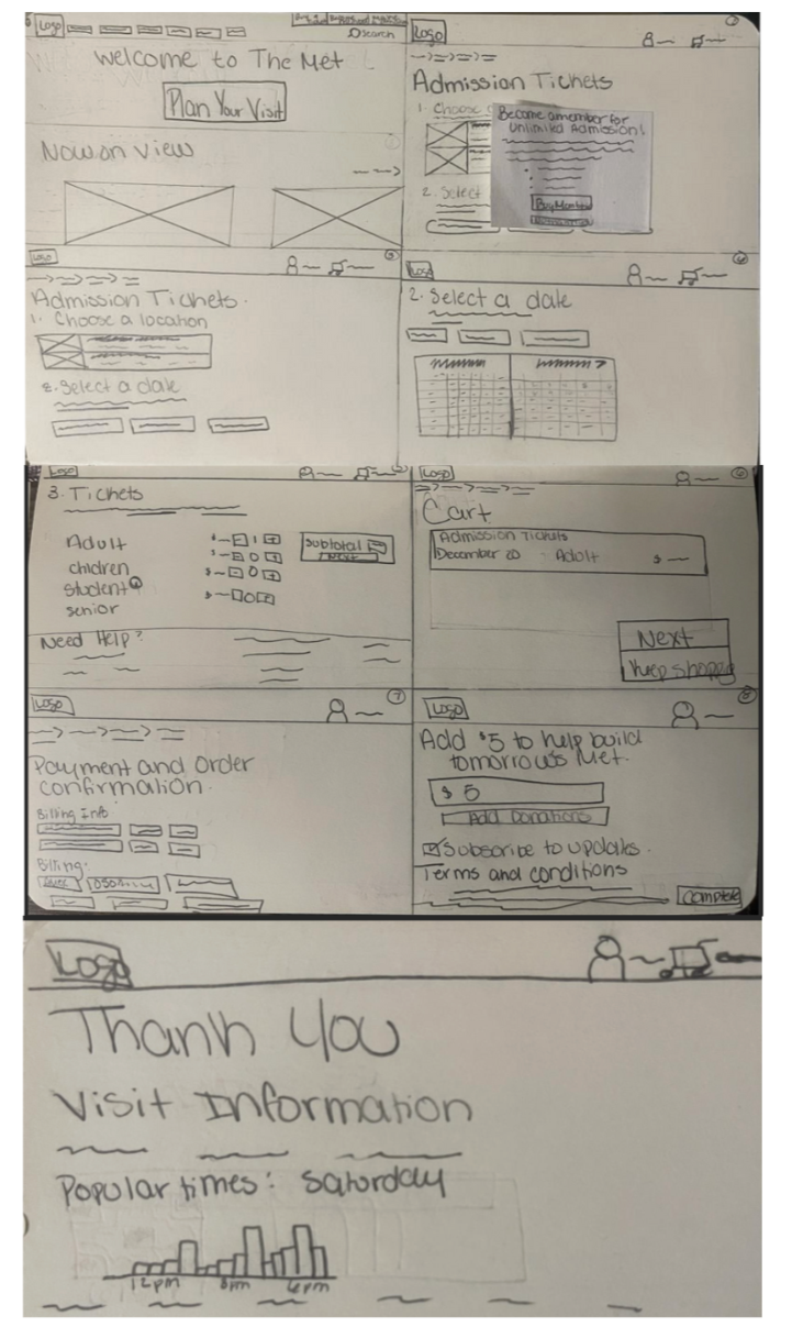
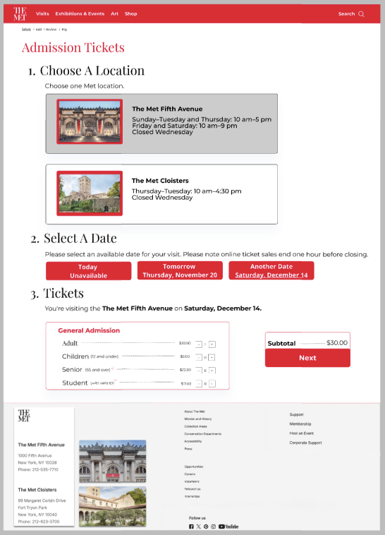
Mapped a clearer, step-by-step purchasing process with improved location selection and pricing clarity.
Exhibitions & Events Flow Sketch
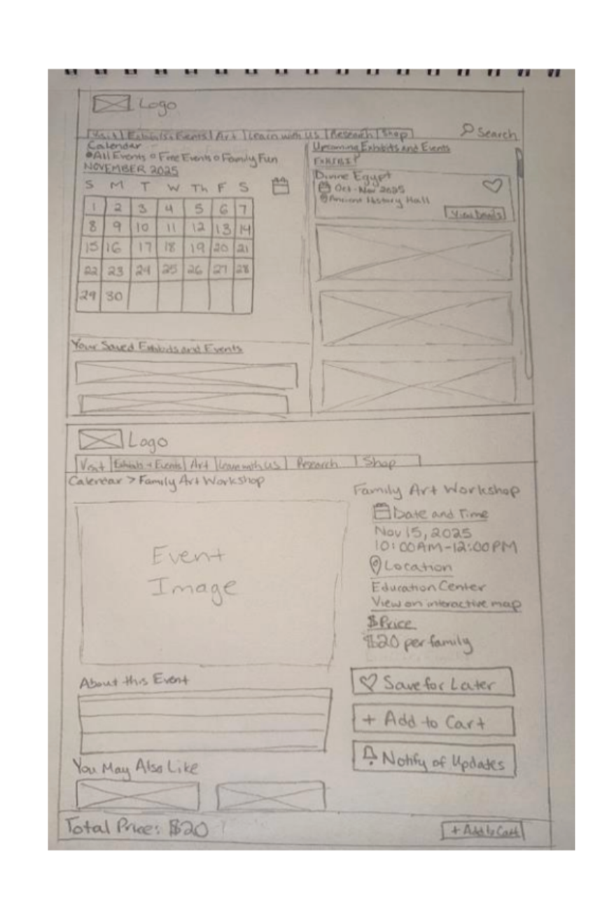
Tested browsing and filtering structures to make discovery and scheduling faster and more intuitive.
From Sketches to Wireframes
With key layouts and flows validated through early exploration, we transitioned into low-fidelity wireframes to define structure, hierarchy, and interaction patterns. This phase focused on translating conceptual ideas into clear, scannable interfaces that support efficient navigation and task completion.
Home Page
Hero & Primary CTAs
Featured Content & Discovery Sections
Ticket Selection & Pricing
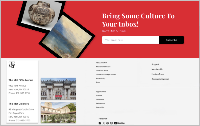
Footer & Newsletter System
Admission Ticketing Wireframe
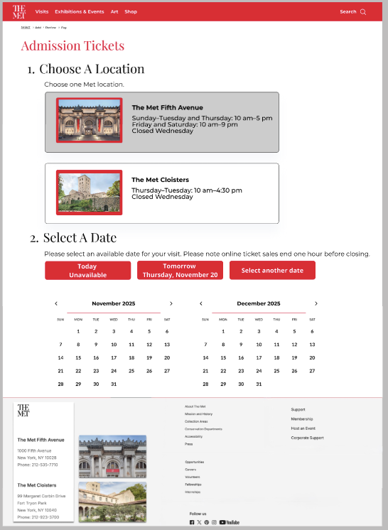
Location & Date Entry
Exhibitions & Events Wireframe
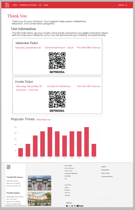
Confirmation & Digital Ticketing
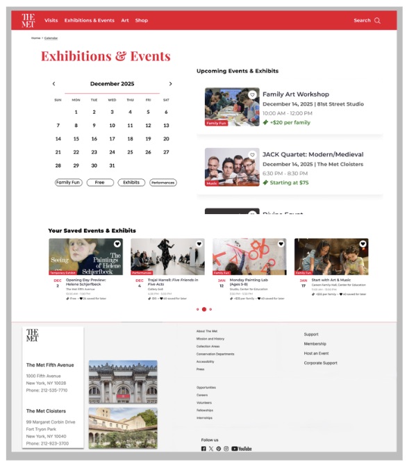
Events Discovery
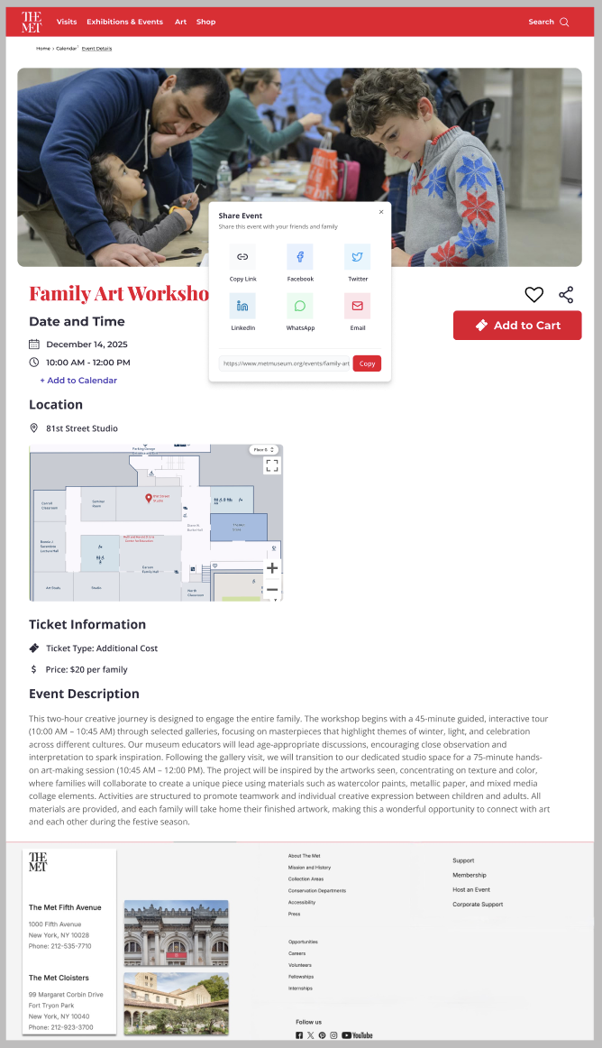
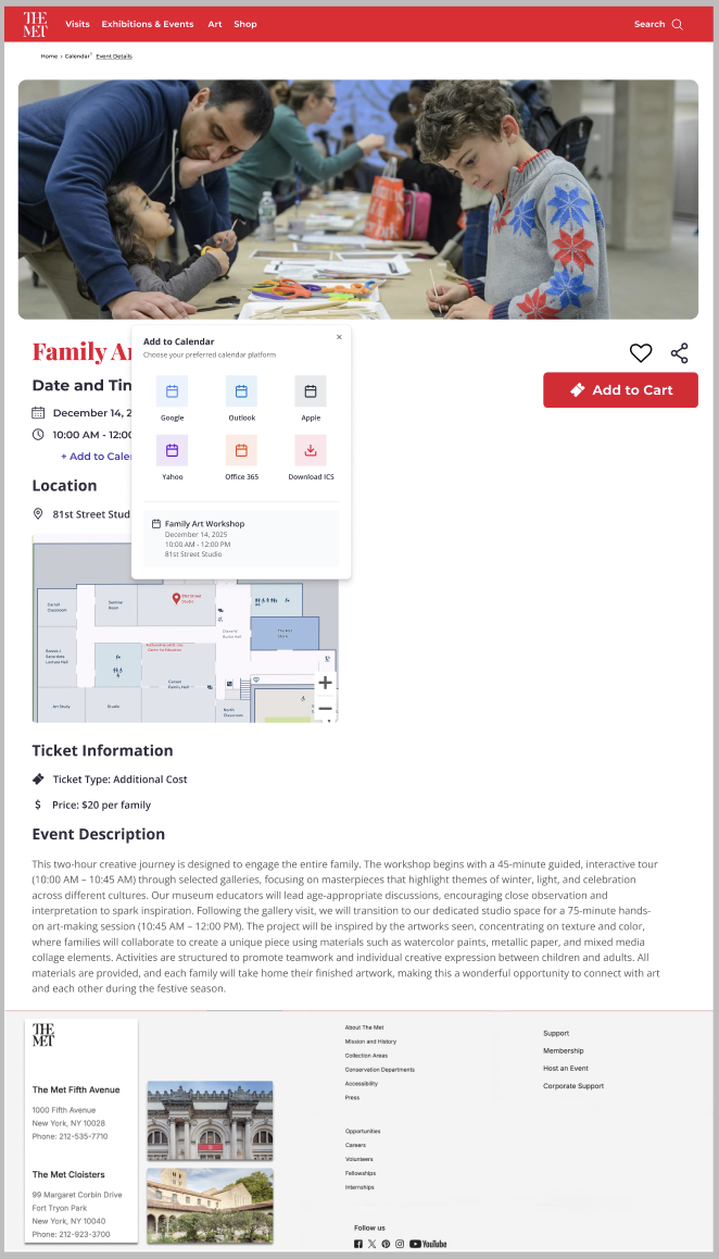
Event Details
Events Confirmation
User Feedback & Iteration
To evaluate the usability and clarity of the redesigned experience, we conducted live usability walkthroughs using a high-fidelity prototype. Participants from diverse professional backgrounds, including project management, government consulting, academia, and operations, completed key tasks such as ticket purchasing and event discovery while verbally narrating their thought process.
Key Issues Identified
Confusion around the museum’s two locations early in the ticketing flow
Calendar layout felt crowded during date selection
Membership prompts interrupted task flow
Some elements appeared interactive but were not
Inconsistent spacing across long scrolling pages
Design Changes Based on Feedback
Clarified location selection earlier in the ticket flow
Reduced frequency and prominence of membership prompts
Improved spacing and alignment across page layouts
Strengthened visual hierarchy of key actions
Enhanced confirmation screens with clearer organization of ticket details
What Users Liked
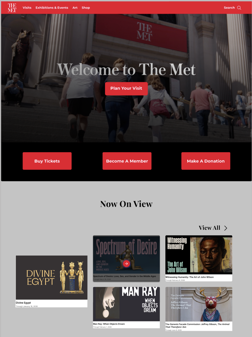
Strong visual impact of homepage imagery
Clear and transparent pricing in the ticket flow
Intuitive event discovery experience
Distinct QR codes for admission and events
“Popular Times” feature improved visit planning confidence
Final Design Solution
The final high-fidelity prototype transforms The Met’s website into a clear, intuitive experience that supports visit planning, exhibition discovery, and ticket purchasing without overwhelming users.
By simplifying navigation, strengthening visual hierarchy, and restructuring key flows, the design enables users to move from exploration to action more confidently and efficiently.
The result is a more accessible, scannable, and cohesive experience that preserves The Met’s visual identity while significantly improving usability.
Reflection & Takeaways
This project challenged me to rethink how to design for clarity within a content-heavy, real-world system. Rather than adding new features, the most impactful decisions came from removing friction, simplifying structure, and prioritizing what users actually need in the moment.
Working on a platform like The Met reinforced the importance of designing within constraints—balancing usability improvements with an established brand and large-scale information architecture. It pushed me to be more intentional with hierarchy, spacing, and interaction design, knowing that even small changes could significantly affect how users navigate and make decisions.
Most importantly, this project strengthened my ability to design end-to-end experiences, from initial exploration to refined flows, while continuously incorporating user feedback. It deepened my focus on creating interfaces that feel intuitive, reduce cognitive load, and support users in moving forward with confidence.